Comentsys.Toolkit.Blazor
1.0.0
dotnet add package Comentsys.Toolkit.Blazor --version 1.0.0
NuGet\Install-Package Comentsys.Toolkit.Blazor -Version 1.0.0
<PackageReference Include="Comentsys.Toolkit.Blazor" Version="1.0.0" />
<PackageVersion Include="Comentsys.Toolkit.Blazor" Version="1.0.0" />
<PackageReference Include="Comentsys.Toolkit.Blazor" />
paket add Comentsys.Toolkit.Blazor --version 1.0.0
#r "nuget: Comentsys.Toolkit.Blazor, 1.0.0"
#:package Comentsys.Toolkit.Blazor@1.0.0
#addin nuget:?package=Comentsys.Toolkit.Blazor&version=1.0.0
#tool nuget:?package=Comentsys.Toolkit.Blazor&version=1.0.0
Comentsys.Toolkit.Blazor
Comentsys.Toolkit.Blazor is a Toolkit with Components for Blazor Server and / or Blazor WebAssembly using .NET 8 or .NET 9 plus useful Extensions using Comentsys.Toolkit along with Comentsys.Assets.Display.
Change Log
Version 1.0.0
- Initial Release
Asset
Asset Component for Blazor WebAssembly and Blazor Server which can be used to represent an AssetResource in a Blazor application.
Example

Example using
AssetResourcefromShadedFluentEmoji.Get(FluentEmojiType.GrinningFace)in Package ofComentsys.Assets.FluentEmoji.Shaded.
AssetResource
Asset Resource of Asset
Height
Asset Resource Height
Mode
Asset Mode of Asset Resource as Image Tag with Base 64 Encoded SVG or Inline SVG
Title
Title Text of Asset
UseAssetResourceHeight
Use Asset Resource Height if Height not specified
UseAssetResourceWidth
Use Asset Resource Width if Width not specified
Width
Asset Resource Width
AssetMode
Asset Mode of Asset Component
Image
Asset Resource as Image Tag with Base 64 Encoded SVG
Inline
Asset Resource as Inline SVG
Clock
Clock Component for Blazor WebAssembly or Blazor Server with IsRealTimeForWebAssembly is false which can be used to display an analogue Clock in a Blazor application and can customise the colours used.
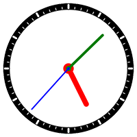
Example
Background
Background Colour of Clock
Fill
Fill Colour of Clock
Foreground
Foreground Colour of Clock Markers
HandsFill
Fill Colours of Clock Hands in order: Hour, Minute, Second
IsRealTimeForWebAssembly
Is Real Time for Blazor WebAssembly?
ShowHourHand
Show Hour Hand on Clock?
ShowMinuteHand
Show Minute Hand on Clock?
ShowSecondHand
Show Second Hand on Clock?
Size
Size of Clock
Stroke
Stroke Colour of Clock
TimeSource
Time Source of Clock
Title
Title Text of Clock
Dial
Dial Component for Blazor WebAssembly can be used to select a Value between a Minimum and Maximum value and can customise the colours used.
Example

Fill
Fill Colour of Dial
Foreground
Foreground Colour of Dial
Knob
Width of Knob of Dial
Maximum
Maximum Value of Dial
Minimum
Minimum Value of Dial
Size
Size of Dial
Title
Title Text of Dial
Value
Value of Dial
ValueChanged
Event Triggered when Dial Value changed
DirectionalPad
DirectionalPad Component for Blazor WebAssembly can be used for selecting a Direction of Up, Down, Left and Right and can customise the colours used.
Example

DirectionChanged
Event Triggered when Directional Pad Direction Changed
DirectionsFill
Fill Colours of Directional Pad in clockwise order: Up, Right, Down, Left
Fill
Fill Colour of Directional Pad
RepeatOnHold
Indicates DirectionChanged should fire repeatedly when Directional Pad direction is held
Size
Size of Directional Pad
Title
Title Text of Directional Pad
DirectionalPadDirection
Direction of Directional Pad Component
Down
Down Pad Direction
Left
Left Pad Direction
Right
Right Pad Direction
Up
Up Pad Direction
DirectionalStick
DirectionalStick Component for Blazor WebAssembly can be used to select an Angle around the centre and Ratio between the centre and the outer edge along with being able to customise the colours used.
Example

Fill
Fill Colour of Directional Stick
Foreground
Foreground Colour of Directional Stick Knob
Sensitivity
Sensitivity of Directional Stick
Size
Size of Directional Stick
Title
Title Text of Directional Stick
ValueChanged
Event Triggered when Directional Stick Value Changed
DirectionalStickValue
Value of Directional Stick Component
| Name | Description |
|---|---|
| angle | Unknown type<br>Stick Angle around Centre |
| ratio | Unknown type<br>Stick Ratio from Centre |
Constructor(angle, ratio)
Directional Stick Value
| Name | Description |
|---|---|
| angle | System.Double<br>Stick Angle around Centre |
| ratio | System.Double<br>Stick Ratio from Centre |
Angle
Stick Angle around Centre
Ratio
Stick Ratio from Centre
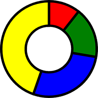
Donut
Donut Component for Blazor WebAssembly and Blazor Server which can be used to display a set of values in a donut-chart with a Hole or pie chart without one along with being able to customise the colours used.
Example
Hole
Size of Donut Hole
Items
Donut Items
SectorsFill
Fill Colours of Donut Sectors in clockwise order
Size
Size of Donut
Stroke
Stroke Colour of Donut Sectors
StrokeWidth
Stroke Width of Donut Sectors
Title
Title Text of Donut
Gauge
Gauge Component for Blazor WebAssembly and Blazor Server to indicate a Value between a Minimum and Maximum value along with being able to customise the colours used.
Example

Fill
Fill Colour of Gauge
Foreground
Foreground Colour of Gauge
Maximum
Maximum Value of Gauge (Less Than or Equal to 100)
Minimum
Minimum Value of Gauge (Greater Than or Equal to 0)
Needle
Width of Needle of Gauge
Size
Size of Gauge
Title
Title Text of Gauge
Value
Value of Gauge
SegmentDisplay
SegmentDisplay Component for Blazor WebAssembly or Blazor Server with IsRealTimeForWebAssembly as false which can be used for a seven-segment based Display in a Blazor application and can customise the colours used.
Example

DateFormat
Date Format of Display if using Display Mode of Date
DateTimeSource
Date Time Source of Display if using Display Mode of Time, Date or TimeDate
DisplayFill
Fill colours of the Display in order from left to right
Fill
Fill colour of the Display
Height
Display Height
IsRealTimeForWebAssembly
Is Real Time for Blazor WebAssembly if using Display Mode of Time, Date or TimeDate
Mode
Display Mode of Time, Date, TimeDate or
Title
Title Text of Display
TimeDateFormat
Time and Date Format of Display if using Display Mode of TimeDate
TimeFormat
Time Format of Display if using Display Mode of Time
Value
Value of the Display if using Display Mode of Value
Width
Display Width
MatrixDisplay
MatrixDisplay Component for Blazor WebAssembly or Blazor Server with IsRealTimeForWebAssembly as false which can be used for a five-by-seven dot-matrix based Display in a Blazor application and can customise the colours used.
Example

DateFormat
Date Format of Display if using Display Mode of Date
DateTimeSource
Date Time Source of Display if using Display Mode of Time, Date or TimeDate
DisplayFill
Fill colours of the Display in order from left to right
Fill
Fill colour of the Display
Height
Display Height
IsRealTimeForWebAssembly
Is Real Time for Blazor WebAssembly if using Display Mode of Time, Date or TimeDate
Mode
Display Mode of Time, Date, TimeDate or Value
Style
Display Style
Title
Title Text of Display
TimeDateFormat
Time and Date Format of Display if using Display Mode of TimeDate
TimeFormat
Time Format of Display if using Display Mode of Time
Value
Value of the Display if using Display Mode of Value
Width
Display Width
DisplayMode
Display Mode of SegmentDisplay or MatrixDisplay
Date
Display Date as Date Format of dd-MM-yyyy by Default
Time
Display Time as Time Format of HH:mm:ss by Default
TimeDate
Display Time and Date as Time Date Format of HH:mm:ss dd-MM-yyyy by Default
Value
Display any Value containing 0 - 9, Dash, Colon and Space also used for unsupported characters
Sector
Sector Component for Blazor WebAssembly and Blazor Server can be used to represent a portion or Arc section of a Circle as needed where the Start and Finish position of the Sector can be set along with the Hole which allows for a variety of combinations for display along with being able to customise the colours used.
Example

Fill
Fill Colour of Sector
Finish
Finish Angle of Sector
Hole
Size of Sector Hole
Size
Size of Sector
Start
Start Angle of Sector
Stroke
Stroke Colour of Sector
StrokeWidth
Stroke Width of Sector
Title
Title Text of Sector
Extensions
Comentsys.Toolkit.Blazor contains some useful Methods such as getting the Data Uri of an AssetResource or ImageResource along with converting a System.Drawing.Color to a HTML colour.
AsDataUri(assetResource)
As Data Uri
| Name | Description |
|---|---|
| assetResource | Comentsys.Toolkit.AssetResource<br>Asset Resource |
Returns
Data Uri
AsDataUri(imageResource)
As Data Uri
| Name | Description |
|---|---|
| imageResource | Comentsys.Toolkit.ImageResource<br>Image Resource |
Returns
Data Uri
AsHtmlColor(color)
As HTML Colour
| Name | Description |
|---|---|
| color | System.Drawing.Color<br>Drawing Color |
Returns
HTML Colour String
AsHtmlColor(color)
As HTML Colour
| Name | Description |
|---|---|
| color | System.Nullable{System.Drawing.Color}<br>Drawing Color |
Returns
HTML Colour String
Licence
MIT License

Copyright (c) Comentsys

Permission is hereby granted, free of charge, to any person obtaining a copy
of this software and associated documentation files (the "Software"), to deal
in the Software without restriction, including without limitation the rights
to use, copy, modify, merge, publish, distribute, sublicense, and/or sell
copies of the Software, and to permit persons to whom the Software is
furnished to do so, subject to the following conditions:

The above copyright notice and this permission notice shall be included in all
copies or substantial portions of the Software.

THE SOFTWARE IS PROVIDED "AS IS", WITHOUT WARRANTY OF ANY KIND, EXPRESS OR
IMPLIED, INCLUDING BUT NOT LIMITED TO THE WARRANTIES OF MERCHANTABILITY,
FITNESS FOR A PARTICULAR PURPOSE AND NONINFRINGEMENT. IN NO EVENT SHALL THE
AUTHORS OR COPYRIGHT HOLDERS BE LIABLE FOR ANY CLAIM, DAMAGES OR OTHER
LIABILITY, WHETHER IN AN ACTION OF CONTRACT, TORT OR OTHERWISE, ARISING FROM,
OUT OF OR IN CONNECTION WITH THE SOFTWARE OR THE USE OR OTHER DEALINGS IN THE
SOFTWARE.
| Product | Versions Compatible and additional computed target framework versions. |
|---|---|
| .NET | net8.0 is compatible. net8.0-android was computed. net8.0-browser was computed. net8.0-ios was computed. net8.0-maccatalyst was computed. net8.0-macos was computed. net8.0-tvos was computed. net8.0-windows was computed. net9.0 is compatible. net9.0-android was computed. net9.0-browser was computed. net9.0-ios was computed. net9.0-maccatalyst was computed. net9.0-macos was computed. net9.0-tvos was computed. net9.0-windows was computed. net10.0 was computed. net10.0-android was computed. net10.0-browser was computed. net10.0-ios was computed. net10.0-maccatalyst was computed. net10.0-macos was computed. net10.0-tvos was computed. net10.0-windows was computed. |
-
net8.0
- Comentsys.Assets.Display (>= 2.0.0)
- Comentsys.Toolkit (>= 1.3.0 && < 2.0.0)
- Microsoft.AspNetCore.Components.Web (>= 8.0.19)
-
net9.0
- Comentsys.Assets.Display (>= 2.0.0)
- Comentsys.Toolkit (>= 1.3.0 && < 2.0.0)
- Microsoft.AspNetCore.Components.Web (>= 9.0.8)
NuGet packages
This package is not used by any NuGet packages.
GitHub repositories
This package is not used by any popular GitHub repositories.
| Version | Downloads | Last Updated |
|---|---|---|
| 1.0.0 | 132 | 9/2/2025 |
1.0.0 - Initial Release